Charts & Reports
Create charts and reports based on the data from your monday.com board and output them on your PDF documents.
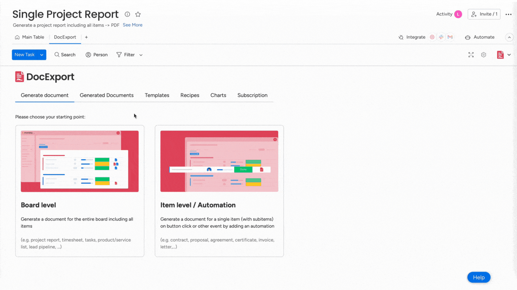
Create Charts & Reports
You can generate charts based on data from your monday.com board by using DocExport. These charts can be output on your document by using specific placeholders.
This article is all about how to generate charts by using DocExport. If you want to learn how to insert them into your documents, take a look here.
Project Reports? Inventory Overview? Sure, but make it look sexy!
Note: Charts are only available for the DocExport Enterprise and Enterprise Unlimited plans.
Generate Charts
- Open the DocExport View and select the tab "Charts"
- Click on "Create new chart".
- Select the type of chart you want to create, e.g. Bar, Pie, Bubble,...
If you're not sure yet, you can simply select a type and you'll get a preview of your possible chart. - Determine which data you want to display on the X and Y axes. See section "Supported field types" for an overview.
- Select the calculation function that serves your use case: Sum, Average, Median, Minimum, Maximum.
- Type in a name for your chart by clicking on the field "New chart". If no name is entered, DocExport will create a name for you.
- Save your chart.
- In order to add your charts to your documents, please follow the steps in this article.
Note: All charts generated by DocExport fulfill the purpose of being output on your PDF documents. They do not replace the chart function that monday.com offers.
Supported field types for charts
Chart X axis:
- People columns
- Status columns (including colors in tables and groups)
- Date columns
Chart Y axis:
- Number columns
- Mirror columns
- Formula columns
- + "Count items", which adds up the number of items present
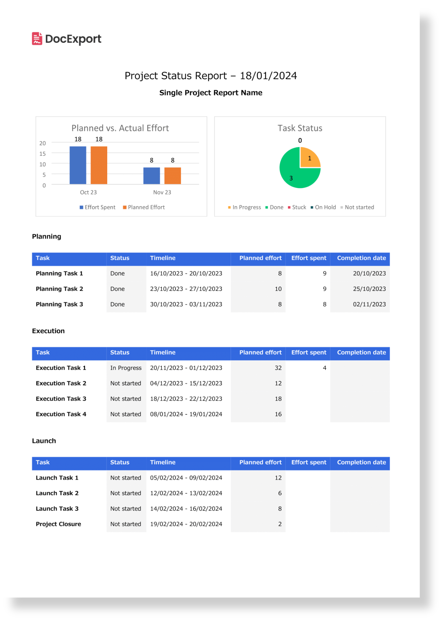
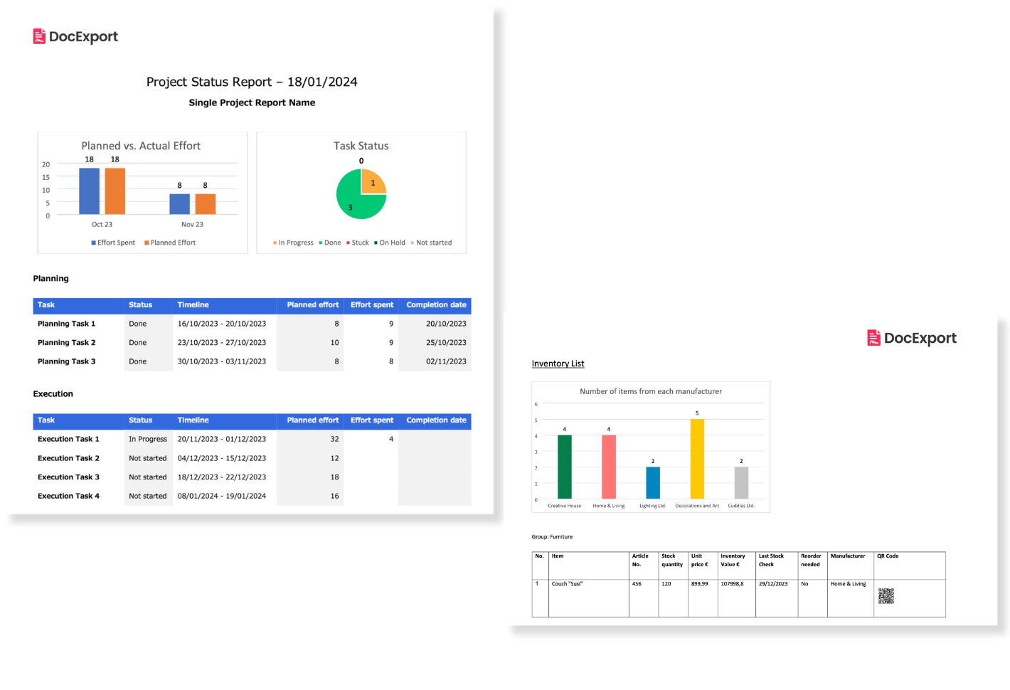
Example Use Case: Reports
In this example, charts have been added to an Executive Project Status Report. You can use your generated charts to prepare your reports graphically and display data in an understandable way.
As you can see in this bar chart example, you can also choose two values on the Y axis so that you can compare two values with each other.